- 100% Free
- No Account Required
- Available 24/7
Free Generative AI Marketing Tools to Transform Marketing for Everyone
Amppfy offers free AI generator to accelerate growth and simplify marketing for businesses and content creators to go to market faster. Our generative AI marketing tools help you drive qualified website traffic, improve SEO keyword rankings, craft engaging SEM marketing campaigns, and grow your social media presence online.


Free Generative AI Marketing Tools to Optimize Efficiency and Scale Productivity
Brand Marketing
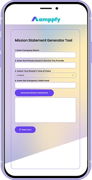
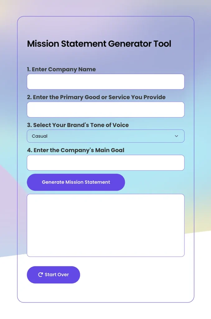
Generate a Creative Business Name, Mission Statement, and Vision Statement
SEO Marketing
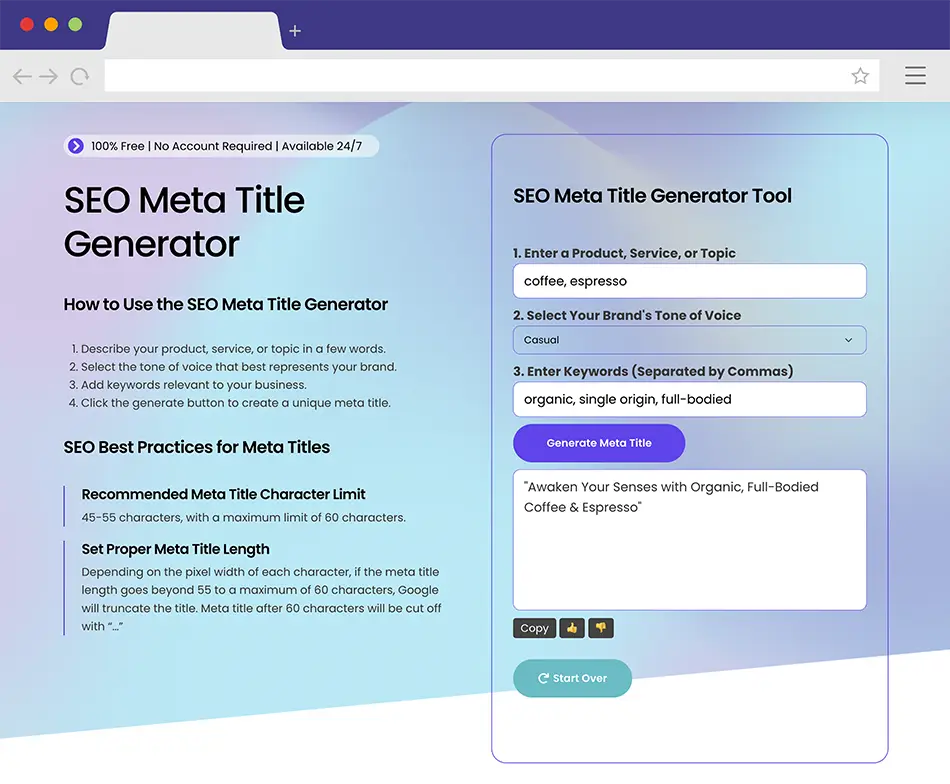
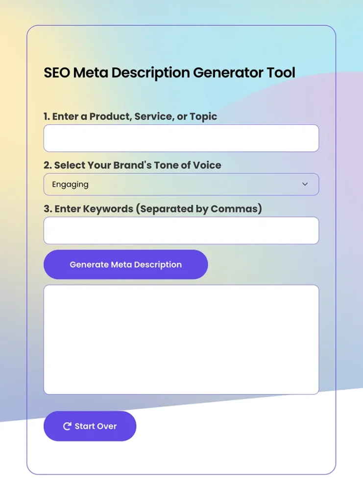
Craft SEO-Friendly Meta Titles and Meta Descriptions Quickly and Efficiently
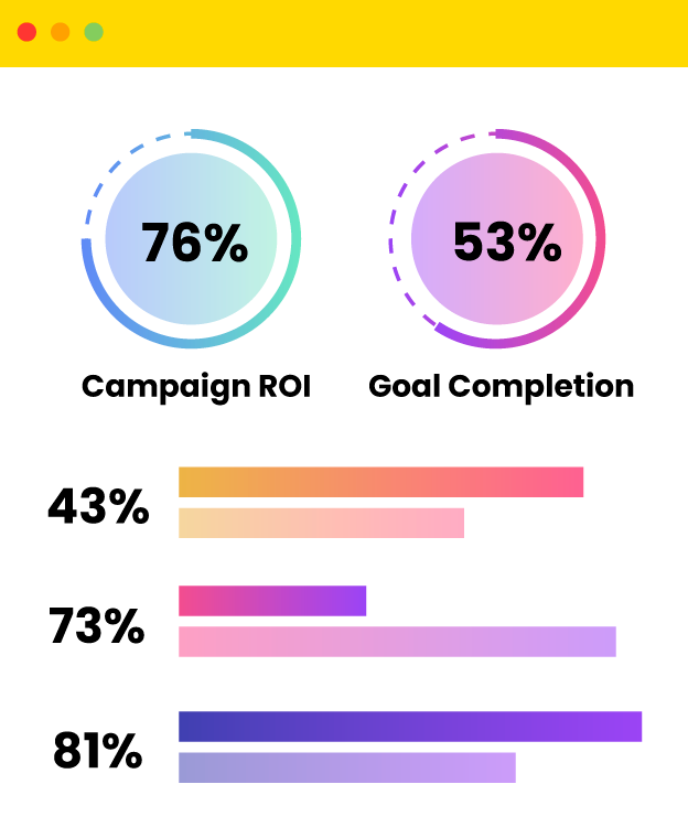
Stand out on Google and Bing’s search engine result pages with our free generative AI marketing tools. Boost organic website traffic and keyword ranking by automating meta title and meta description writing. Draft SEO optimized, compelling meta titles and meta descriptions quickly and at scale so you can focus on growing your business and reaching new customers.
Top Google SEO algorithm to improve website keyword rankings
Best SEO content strategy to increase organic traffic
SEO keyword strategy to identify long-tail keyword opportunities
SEO link building strategies to improve keyword rankings
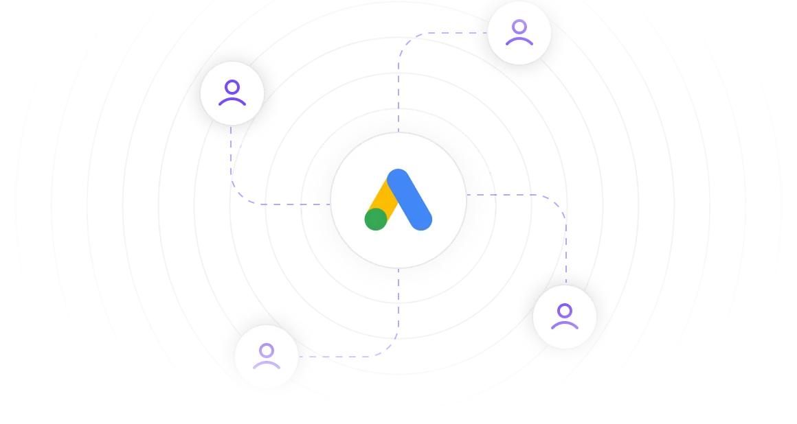
SEM Marketing
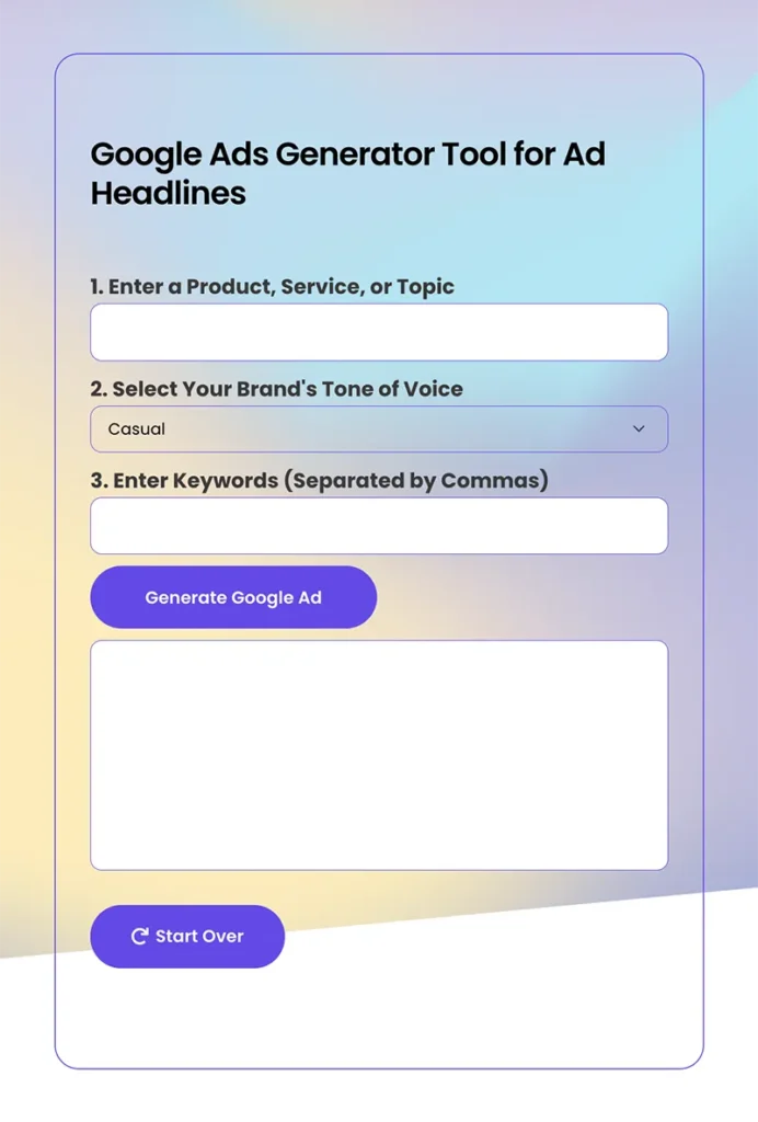
Create Attention-Grabbing SEM Marketing Ad Copies that Drive Conversion
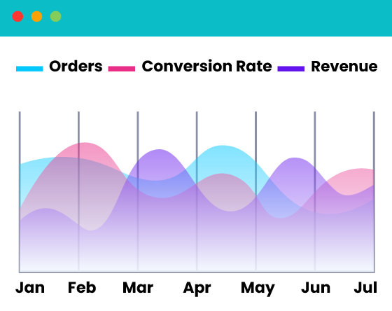
Save time creating highly converting SEM headlines and SEM description text ads. Launch targeted SEM ads to ready-to-buy customers actively searching on Google and Bing. Ensure your brand stands out by highlighting unique product or service propositions with ad campaigns that drive sales and convert potential customers.
Step-by-step introduction guide to SEM marketing
High-performing SEM marketing ad bidding strategies
Leverage SEM marketing ad scheduling to reduce campaign cost
Increase conversion rate with SEM marketing campaigns
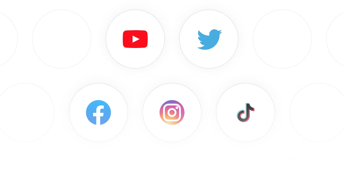
Social Media Marketing
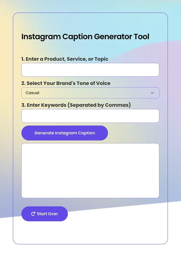
Build a Highly Engaging Community through Social Media Marketing
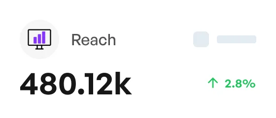
Publish engaging social media posts in half the time. Write impactful social media messaging that resonates with your audience and actively drives customers to your website. Expand reach and open new markets by creating social media content that generates more response and higher engagement rate.
Step-by-step guide to building social media brand awareness
Best approaches to increase social media followers
Effective strategies to drive successful social media advertising campaigns
Hyperlocal social media marketing strategies for local businesses
Marketing Resources and Hands-on Learning Available 24/7
Learn Marketing Best Practices from Our Free and Beginner-Friendly Resource Library
SEO Marketing
SEM Marketing
Social Media Marketing
How to Start a Website